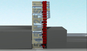
ISTANBUL EARTH CENTRE
Building Type: Disaster Education Institute (competition entry)
Location: Istanbul, Turkey
Size: 34,000 m2
Structural Consultant: Robert Silman Associates
Mechanical/Sustainability Consultant: ARUP
Design: 2011
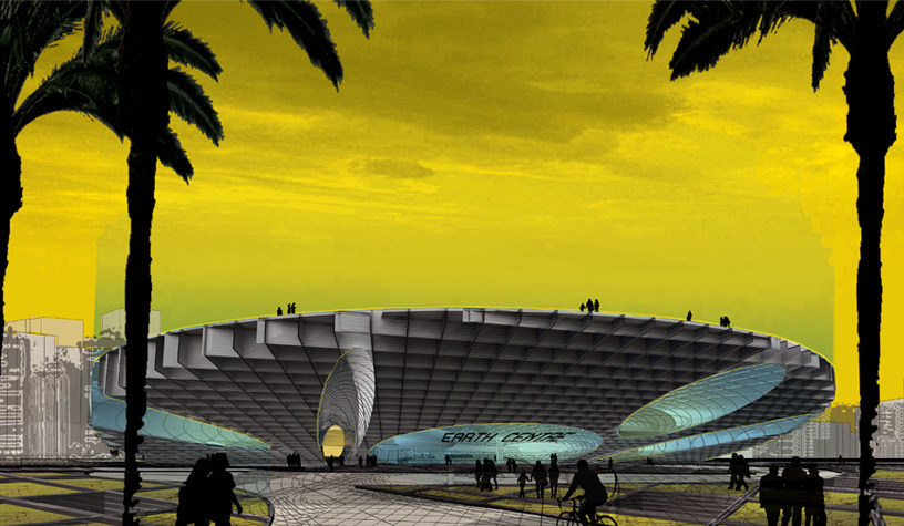
The Istanbul Earth Centre is conceived as an abstract landscape, with the building arising and spreading from the earth organically—a contemporary nod to the mountain ranges of ancient Cappadocia. We imagined a huge massing of earth being lifted or extracted from the ground. Resisting the impulse to create a vertical object, we chose instead to design the structure in direct relation to its ground, its site and its surrounding area, striving for a strong connection with the earth.
Comprised of vertical steel shipping containers assembled together in a dynamic honeycomb pattern, the sculptural volume of the Istanbul Earth Centre is represented by a strong, sloping incline, resembling a man-made hill from afar. This incline and resulting overhang offers strong interaction as visitors approach and begin engaging with the structure. The orientation of the structure’s ground allows direct connectivity to various aspects important to the daily lives of Istanbul citizenry: the pedestrian plaza next to the main entrance serves as a link to a planned mosque next door. In addition, a plaza on the opposite side of the structure offers a cover for car parking and other access points. The Istanbul Earth Centre, in effect, becomes a new destination, as well as a point of activation within the new topography.
The structure for the Istanbul Earth Centre incorporates the basic building blocks of 2,000 (re)used shipping containers into a large stable mass. Voids are removed for visitor access and circulation, as well as to accommodate different programs. The overall structure gains its stability from the large number of containers all tightly connected to one another that, through the transfer of basic horizontal shear forces, form an effectively deeper overall structure. The voids in the mass are spanned locally by smaller clusters of containers that, like corbelling bricks of ancient construction, often arch over the openings and work through simple shear and axial transfer. Overall, the cantilevered end is supported by deep lines of built up containers that find their way continuously between voids and reach from a secure base on the grounded end to the edge of the cantilever.
The structure largely relies upon the understood strength of each container; the shear and axial transfer between each container (at force levels significantly less than those experienced in a heavy sea); and the basic principles of structure that underlie beam action; cantilevered structures; and arches. Constructed almost entirely of Corten steel, the centre’s assembly produces a strong and durable structure that lends itself to positively withstanding extreme environmental pressures, such as seismic, wind and varying temperatures. This imaginative repurposing of the shipping container expresses the dynamic innovation embodied by the Istanbul Earth Centre.
Location: Istanbul, Turkey
Size: 34,000 m2
Structural Consultant: Robert Silman Associates
Mechanical/Sustainability Consultant: ARUP
Design: 2011
The Istanbul Earth Centre is conceived as an abstract landscape, with the building arising and spreading from the earth organically—a contemporary nod to the mountain ranges of ancient Cappadocia. We imagined a huge massing of earth being lifted or extracted from the ground. Resisting the impulse to create a vertical object, we chose instead to design the structure in direct relation to its ground, its site and its surrounding area, striving for a strong connection with the earth.
Comprised of vertical steel shipping containers assembled together in a dynamic honeycomb pattern, the sculptural volume of the Istanbul Earth Centre is represented by a strong, sloping incline, resembling a man-made hill from afar. This incline and resulting overhang offers strong interaction as visitors approach and begin engaging with the structure. The orientation of the structure’s ground allows direct connectivity to various aspects important to the daily lives of Istanbul citizenry: the pedestrian plaza next to the main entrance serves as a link to a planned mosque next door. In addition, a plaza on the opposite side of the structure offers a cover for car parking and other access points. The Istanbul Earth Centre, in effect, becomes a new destination, as well as a point of activation within the new topography.
The structure for the Istanbul Earth Centre incorporates the basic building blocks of 2,000 (re)used shipping containers into a large stable mass. Voids are removed for visitor access and circulation, as well as to accommodate different programs. The overall structure gains its stability from the large number of containers all tightly connected to one another that, through the transfer of basic horizontal shear forces, form an effectively deeper overall structure. The voids in the mass are spanned locally by smaller clusters of containers that, like corbelling bricks of ancient construction, often arch over the openings and work through simple shear and axial transfer. Overall, the cantilevered end is supported by deep lines of built up containers that find their way continuously between voids and reach from a secure base on the grounded end to the edge of the cantilever.
The structure largely relies upon the understood strength of each container; the shear and axial transfer between each container (at force levels significantly less than those experienced in a heavy sea); and the basic principles of structure that underlie beam action; cantilevered structures; and arches. Constructed almost entirely of Corten steel, the centre’s assembly produces a strong and durable structure that lends itself to positively withstanding extreme environmental pressures, such as seismic, wind and varying temperatures. This imaginative repurposing of the shipping container expresses the dynamic innovation embodied by the Istanbul Earth Centre.
WHITNEY STUDIO
Client: The Whitney Museum of American Art
Building Type: Art Studio/Gallery
Location: New York City
Size: 720 SF
Design: 2011
Structural Consultant: Robert Silman Associates
Completion: 2012
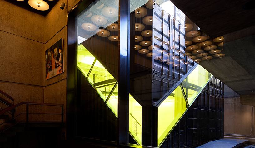
LOT-EK was commissioned to design a special architectural installation for the Whitney Museum of American Art. The Whitney Studio installation will be located in the Sculpture Court of the museum’s Marcel Breuer building on Madison Avenue. The studio will function as a gallery for special exhibits and will house activities for the museum’s education programs, including art-making classes for adults, teens, and families and informal lectures.
The concept employs 6 shipping containers stacked on two levels to form a concise, minimalist cube. The Whitney Studio is specifically designed to fit the smaller area of the Whitney’s open moat, on the south side of the entry bridge. A diagonal and continuous band of fenestration runs along two sides and along the roof to provide natural light and offers a glimpse of activities to museum visitors. Operable windows allow for transfer of airflow when in use (as a supplement to HVAC). Inside, the studio offers a double height space and a triangular mezzanine for the production and display of art work
Building Type: Art Studio/Gallery
Location: New York City
Size: 720 SF
Design: 2011
Structural Consultant: Robert Silman Associates
Completion: 2012
LOT-EK was commissioned to design a special architectural installation for the Whitney Museum of American Art. The Whitney Studio installation will be located in the Sculpture Court of the museum’s Marcel Breuer building on Madison Avenue. The studio will function as a gallery for special exhibits and will house activities for the museum’s education programs, including art-making classes for adults, teens, and families and informal lectures.
The concept employs 6 shipping containers stacked on two levels to form a concise, minimalist cube. The Whitney Studio is specifically designed to fit the smaller area of the Whitney’s open moat, on the south side of the entry bridge. A diagonal and continuous band of fenestration runs along two sides and along the roof to provide natural light and offers a glimpse of activities to museum visitors. Operable windows allow for transfer of airflow when in use (as a supplement to HVAC). Inside, the studio offers a double height space and a triangular mezzanine for the production and display of art work
PIER 57 - NYC
Client: Young Woo & Associates / Hudson River Park Trust
Building Type: Mixed Use (market, restaurants, park, outdoor theater)
Location: Hudson River, New York City
Size: 400,000 SF
Structural Consultant: Robert Silman Associates
Mechanical/Sustainability Consultant: Buro Happold
Completion: Expected 2014
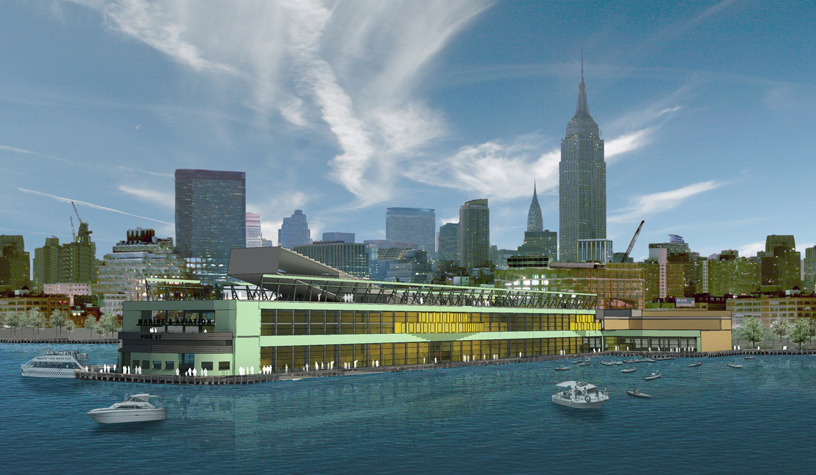
The conversion of Pier 57 seeks to transform the utilitarian industrial building into an open and public building that weaves, within its four-level existing structure, the outdoor environment of the Hudson River Park with cultural and leisure indoor activities. The program includes a 170,000 square-foot covered, open-air food and retail market, which will contain New York’s first large-scale concentration of year-round, affordable work/sell space for artisans and other small businesses. In addition, the structure will contain restaurants on ground and second levels, a park with an outdoor movie and performance amphitheater on the roof, a boat marina with cafés along the exterior esplanades. The design retains the existing interior ramp connecting ground and second floor and continues it from the second floor to the roof as an open public street. The diagonal trajectory will take visitors through the building directly from the main entrance along the Hudson River Park promenade as an inclined extension of 15th street - a covered street that traverses the entire structure flanked by activity, open to city and sky views and bathed by natural light. The interior architecture of the retail/urban market is articulated through the reuse of shipping containers, as a sustainable practice, as well as a reference to the shipping history of the river and the pier’s previous port function. At the roof level, the motif of the ramp is continued to form an open amphitheater within the elevated park. The amphitheater acts as a cover for the ramp below, a solarium and social space in the daytime, and an event infrastructure at night, for outdoor screenings and performances programmed by the Tribeca Film Festival.
Building Type: Mixed Use (market, restaurants, park, outdoor theater)
Location: Hudson River, New York City
Size: 400,000 SF
Structural Consultant: Robert Silman Associates
Mechanical/Sustainability Consultant: Buro Happold
Completion: Expected 2014
The conversion of Pier 57 seeks to transform the utilitarian industrial building into an open and public building that weaves, within its four-level existing structure, the outdoor environment of the Hudson River Park with cultural and leisure indoor activities. The program includes a 170,000 square-foot covered, open-air food and retail market, which will contain New York’s first large-scale concentration of year-round, affordable work/sell space for artisans and other small businesses. In addition, the structure will contain restaurants on ground and second levels, a park with an outdoor movie and performance amphitheater on the roof, a boat marina with cafés along the exterior esplanades. The design retains the existing interior ramp connecting ground and second floor and continues it from the second floor to the roof as an open public street. The diagonal trajectory will take visitors through the building directly from the main entrance along the Hudson River Park promenade as an inclined extension of 15th street - a covered street that traverses the entire structure flanked by activity, open to city and sky views and bathed by natural light. The interior architecture of the retail/urban market is articulated through the reuse of shipping containers, as a sustainable practice, as well as a reference to the shipping history of the river and the pier’s previous port function. At the roof level, the motif of the ramp is continued to form an open amphitheater within the elevated park. The amphitheater acts as a cover for the ramp below, a solarium and social space in the daytime, and an event infrastructure at night, for outdoor screenings and performances programmed by the Tribeca Film Festival.
APAP OpenSchool
Client: APAP - Kyong Park / City of Anyang
Building Type: Art School
Location: Anyang, Korea
Size: 2,600 SF indoor + 2,900 SF outdoor
Structural Consultant: Robert Silman Associates
Completed: 2010
AWARDS:
2011 AIANY Architecture Honors Award
2011 American Architecture Award
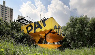
Eight shipping containers are shifted and cut along a 45 degree angle and combined in a fishbone pattern generating a large arrow-like volume lifted three meters over the landscape. Two containers are angled upward and downward to reach ground and sky. Positioned along the river edge to activate the recreational space of the riverfront and to allow its users to be visitors, spectators and actors during the course of the public art program of APAP2010, OpenSchool is a shipping container structure hovering over Hakwoon park pedestrian walkway at the city level right at the drop to the river bank, marking the territory as a focal place of gathering, resting and viewing. The strong graphic treatment of the new structure of the APAP2010 OpenSchool, with its bright yellow and black structure, lettering and deck, makes it a landmark within the urban fabric of Anyang. LOT-EK designed the OpenSchool within the critical framework set up by Kyong Park - historic New York figure, founder of the Storefront for Art and Architecture and artistic director of Anyang Public Art Program 2010.
The building is a testing ground for radical container assemblies with high sculptural potential:
• the shearing of containers along unexpected angles
• the bending of containers outside of their horizontal volume
• the floating of containers in mid-air to defy their heavy mass
APAP OpenSchool was built as a partial prefabricated structure, with all containers modified off site. The raw modules were trucked to the site and craned to connect to the main steel frame. Once the assembly was fully erected, two separate crews worked simultaneously -- one on the building interiors, with another handling exterior and landscaping -- providing efficiency for significant time savings. The entire building was completed in less than 6 months.
Building Type: Art School
Location: Anyang, Korea
Size: 2,600 SF indoor + 2,900 SF outdoor
Structural Consultant: Robert Silman Associates
Completed: 2010
AWARDS:
2011 AIANY Architecture Honors Award
2011 American Architecture Award
Eight shipping containers are shifted and cut along a 45 degree angle and combined in a fishbone pattern generating a large arrow-like volume lifted three meters over the landscape. Two containers are angled upward and downward to reach ground and sky. Positioned along the river edge to activate the recreational space of the riverfront and to allow its users to be visitors, spectators and actors during the course of the public art program of APAP2010, OpenSchool is a shipping container structure hovering over Hakwoon park pedestrian walkway at the city level right at the drop to the river bank, marking the territory as a focal place of gathering, resting and viewing. The strong graphic treatment of the new structure of the APAP2010 OpenSchool, with its bright yellow and black structure, lettering and deck, makes it a landmark within the urban fabric of Anyang. LOT-EK designed the OpenSchool within the critical framework set up by Kyong Park - historic New York figure, founder of the Storefront for Art and Architecture and artistic director of Anyang Public Art Program 2010.
The building is a testing ground for radical container assemblies with high sculptural potential:
• the shearing of containers along unexpected angles
• the bending of containers outside of their horizontal volume
• the floating of containers in mid-air to defy their heavy mass
APAP OpenSchool was built as a partial prefabricated structure, with all containers modified off site. The raw modules were trucked to the site and craned to connect to the main steel frame. Once the assembly was fully erected, two separate crews worked simultaneously -- one on the building interiors, with another handling exterior and landscaping -- providing efficiency for significant time savings. The entire building was completed in less than 6 months.
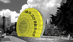
DAEGU PUBLIC LIBRARY
Building type: Public Library (competition entry)
Location: Daegu, Korea
Size: 33,000 SF
Structural Consultant: Robert Silman Associates
Design: 2012
The mission of every library is evolving from the simple storage of information, to a more complex exchange of information accessed through both digital and physical media. The library adds to its traditional reading rooms and book stacks a constellation of new places for gathering and growing: assembly and community rooms, galleries and gardens, spaces for children and families, and more.
Our vision for the Daegu Gosan Public Library is for a building with a strong character: for a very strong and very special landmark on the local skyline that inspires a feeling of identification and investment in the community it serves. Within the building, our vision is for a dynamic relationship between diverse spaces that enables lively exchanges between visitors, but also provides the acoustic protection and functional organization that enable the library to function with efficiency and serenity. The building has, externally, a powerful sculptural presence that anchors a complex and varied urban site, and has, internally, a subtle variety of big and small spaces, and a careful curatorship of daylight and views, that ensures a lively yet scholarly atmosphere. The scale of the structure mediates between the adjacent low-rise residences and the high-rise towers to the North of the road. The round form of the structure makes it stand out as a clear icon of public life, and distinguishes it from the sometimes repetitive rectangular geometries of the nearby residential towers.
The Architectural Idea
The plaza leads down to an independent entrance for the assembly room/auditorium at the lowest level, and to exhibition spaces on an adjacent mezzanine. On the South side of the building, a street-level entrance leads visitors to the lobby/information area of the library. In the lobby; a translucent ceiling filters in daylight from an atrium above, while filtering out sound from the entry area. The floor of that atrium is the second level above ground, and serves as the main library level, which is overlooked by four terraced reading areas, each on their own mezzanine, and by book stacks and shelves.
The terraced layout encircling the atrium allows for functional efficiency, but also for great visual connections and meaningful understandings between different areas and activities. A variety of public and semi-private areas for browsing, consulting, readying, studying, lounging, and more, is generated by the juxtaposition of large open spaces and intimate alcove-like areas. This variety of spatial experiences supports the harmonious balance between active and restful, focused and reflective, representing a library at its best.
Above this main area, is an acoustically-protected children’s activity area, with a double-height area occupied by a stepped amphitheater dedicated to playful learning activities. Above that, with commanding views both inside and outside, are administrative offices. A roof garden and observatory crowns the structure, which creates another spectacular connection between library and park, neighborhood and city and allows for more leisure activities and social interaction.
The Structural and Technological Systems
The structure has been designed with careful attention to sustainable building systems and contemporary technology. It is composed of some 170 standard ISO shipping containers, which have been stacked cut on the outside and carved on the inside to create flowing interior spaces and sculptural curves. This approach offers substantial advantages in both economy and environmental sustainability. A complex and expressive form can be generated with an unusually efficient structural system. This creative “upcycling” of prefabricated components has an even more positive environmental impact than the standard recycling of building materials. By mobilizing prefabrication strategies, site work and building fabrication can happen simultaneously, and construction is substantially less disruptive to the ongoing life of the neighborhood and the community: it’s a model of simpler and cleaner construction that sets a tone of proficiency and serenity: a tone and feeling that carries over into the entire life of the building.
This proposal, while innovative, applies twenty years of research and real-world applications in architecture of this kind of building system. In this design, we take advantage of the structural and material economy of the shipping container component, and its ability to be efficiently insulated and integrated with other building systems. We celebrate the contrast between the colorful and tough exterior, and the refined interior with finishes and furnishings appropriate to a modern library environment. We also celebrate the structure's unusual technological beauty, for example, by creating a dynamic pattern of narrow windows that rhymes with the corrugations of the steel surface, letting more light into the atrium areas, and protecting stacks and shelves. This pattern on the building’s East and West walls is complemented by a system of horizontal fins along the edge of the “wheel”; these fins filter views, providing privacy and translucency, as well as solar shading (and sheltering the roof garden/observatory). The fins also incorporate photovoltaic arrays that help power the building. The geometry and north-south orientation of the structure is perfectly optimized for this sustainable gesture.
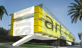
SJSU ART MUSEUM
Client: San Jose State University (Invited Competition)
Design: 2003
Building Type: Museum
Location: San Jose, CA
Size: 40,000 SF
The design for the new San Jose State University Art Museum concentrates the program along the north edge of the existing Art School. The u-shaped building allows an existing courtyard to remain. Although the footprint of the new building is wedged between east and west wings of the existing art school, the top portion bridges over the east wing and aligns with the northeast corner of the site. The front facade (North Elevation) stretches to the east and the west, overlapping and absorbing the end elevations of both wings. The Art Museum was conceived as the “new face” and a filter for the Art School, which in turn assumes a more private realm. The Art Museum building remains completely independent from the Art School, both in terms of structure and circulation, while the courtyard becomes a shared landscaped outdoor “room” enveloped by a shading structure. By bridging over the Art School, and by stretching the north elevation to the entire width of the Art School, the Art Museum establishes a very significant presence along the major pedestrian mall of the campus. The location of the main lobby on the 3rd level of the Museum right at this intersection offers strategic accessibility and a special visual experience. The new elevation is designed to act as a billboard within the landscape of the campus: the containers are grouped by colors to outline different zones along the façade according to the main functions that lie behind them within the core of the building; large scale text indicating those function is printed on the containers’ skin; banners advertising exhibitions and performances are stretched over the west portion of the façade.
VAN ALEN BOOKS
Client: Van Alen Institute
Project Type: Retail, Cultural
Location: Flatiron District, NYC
Size: 505 SF
Completed: 2011
Structural Consultant: Robert Silman Associates
General Contractor: Craft Workshop, Andreas Scholtz
Photography: Danny Bright
LOT-EK was commissioned by the Van Alen Institute: Projects in Public Architecture to conceive and design VAN ALEN BOOKS, a new architecture and design bookstore and public reading room located at the organization’s headquarters in Manhattan. Van Alen Books is motivated by an urgent need for spaces where architecture books can be discovered. Inviting the public to linger and browse, the store features a 14-foot-tall seating platform crafted from a stack of 70 recycled doors, which ascend to create an amphitheater overlooking 22nd Street through glazed storefront windows. Sourced from Build It Green! NYC, a nonprofit supplier of salvaged building materials, the solid wood doors form a triangular installation evoking the steps of Times Square’s TKTS booth, an iconic project originated through Van Alen's 1999 design competition. This highly visible storefront space is New York City’s only book emporium and gathering place devoted singularly to architecture and design publications and serves as an open platform to discuss the future of the architecture book.
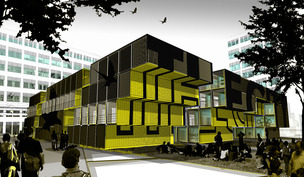
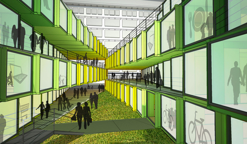
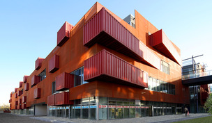
THE CITY
Building Type: Mixed Use (retail, art galleries and studios)
Location: Eindhoven, NL
Size: 6,000 m2
Structural Consultant: Robert Silman Associates
Design: 2011 / Expected completion 2013
LOT-EK’s concept for The City creates a four-level, labyrinth-like center for small retail, leisure and cultural activity in a changing area of Eindhoven, NL. This new concept aims to support two goals, as requested by the client: Creating an iconic environment that, on one level, can stand against the current industrial “monuments” throughout the formal industrial area; Cultivating an intimate, small-scale experience that is complimentary to the large-scale experience of the surroundings. Comprised of stacked rusted steel containers that shift to create “stepping” edges and gaps, the strong volume value of The City is achieved by conceiving it as a medieval cloister, or village. The setting is pierced by alleys and under-passages that functionally connect it to surrounding streets, plazas and upper walkways. The “stepping” aspect of the stacks is reinforced by gradients of different colors on the edges and gaps, which contrast with the natural rusted Corten steel. The intimate experience of The City is achieved by a network of separate yet interconnected buildings and open public spaces. The exterior spaces differ in size and shape, generating a variety of interconnected pathways, porticos, interior plazas, under-passages and terraces. The circulation is mostly exterior on all four levels, and is achieved by linking with exterior stairs and bridges. The use of additional colors – between container stacks and along the facades – serves to create distinct “neighborhoods” within The City.
The City is crossed at the ground level by circulation paths both in directions. This makes the entire area very permeable from all sides, creating strong relations with the Ketelhuisplein and its old power station building in the front, as well as with the lobbies of the “monuments” in the rear. To add a unique element to The City experience, as well as to enhance its connection to the new life in the old buildings of the old neighborhood, we propose designing a landscaped upper walkway to run atop of the existing pipe structure (which currently surrounds The City on two sides). The height of the proposed walkway coincides with the 3rd level of both The City, and the existing industrial buildings being remodeled. By connecting The City and those existing buildings with short bridges to this upper walkway, a completely new and unexpected way of linking and experiencing this new area of Eindhoven is formed. This could go even further in establishing The City as the heart of this new community.
BOHEN FOUNDATION
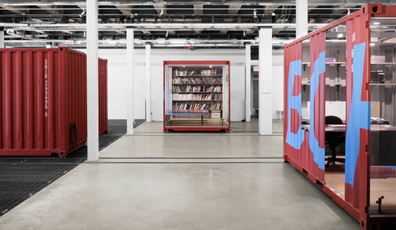
Client: Bohen Foundation
Building Type: Gallery/Museum
Location: New York City
Size: 15,000 SF
Structural Consultant: ARUP
Mechanical/Sustainability Consultant: ARUP
Design: 2002
Photography: Nikolas Koenig
The Bohen Foundation was a private foundation that supported contemporary art and culture. They regularly commissioned and exhibited works of a scale and complexity that did not lend itself to the context of a normal gallery. Its operation requires maximum spatial flexibility to allow the exhibition of different types of media – from two-dimensional drawings and paintings, to projections, sculptural objects, site-specific-work and multi-media installations. To better enable this effort, LOT-EK designed 8 shipping-container sections to perform within the rigid square structural grid of the ground floor of a former printing facility. Two container sections are positioned within each nave of the existing structural grid at the main level. They contain all the permanent activities (office, conference, video library/projection room, and lounge) while also functioning as a movable enclosure. On the outside of each container section, five 15x12-foot movable wall panels are packed on its side. The containers generate exhibition spaces by sliding along tracks to preset locations. Once they are moved to the intended positions, the wall panels are deployed to outline different exhibition spaces. The modularity of the wall panels allows these exhibition spaces to be formed in a variety of sizes and shapes according to different curatorial needs.
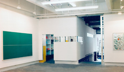
CYNTHIA BROAN GALLERY
Client: Cynthia Broan Gallery
Building Type: Art gallery
Completion: 2005
Location: Chelsea, New York
Size: 3,000 SQFT
Structural Consultant: Buro Happold
The typical white box of the art gallery was minimized into a band of white wall that wraps around the space of a former car repair garage, transforming it into an art space. The additional program is placed in four moveable /flexible elements, enabling multiple configurations of the exhibition spaces and the creation of completely different volumes for each show. These elements are left raw and exposed to contrast to the mute art space as visitors move through the exhibition. The façade is a thin layer of printable vinyl mesh that is draped over the old brick wall, creating an additional ever-changing art surface.
CHELSEA ART TOWER PROPOSAL
Project Name: Chelsea Art Tower (Proposed)
Client: YoungWoo Associates
Building Type: Art galleries
Design: 2004
Location: Chelsea, New York
Size: 110,000 SF
A 19-story hybrid structure is designed to house one contemporary art gallery on each floor. Recycled shipping containers are inserted into the concrete frame along the edge of front and back elevations. The containers are fabricated off-site for efficiency of time and budget, as the site is prepared (to later house bathrooms, mechanical and storage rooms). Additional space is left undivided to offer open plan flexibility for all galleries.
The remaining part of both front and back elevations is enclosed with a light floor-to-ceiling metal framing that supports glazing on the outside and removable wall panels on the inside. This system of removable, insulated wall panels allows each gallery to change the ratio of opaque/transparent wall surface along the perimeter to regulate incoming sunlight - thus conserving energy - and to respond to lighting and display surface needs for exhibition.
Passenger elevators are exposed along the east elevation. An inward bend in at the front base of the tower penetrates a moat, allowing natural light into the basement gallery. A single side cantilever starts at the 12th floor to expand the top floors that recede along the front elevation according to city setback regulations.
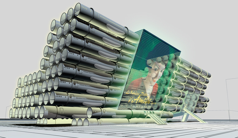
NEW TAIPEI CITY MUSEUM OF ART
Building Type: Museum (competition entry)
Location: Taipei, Taiwan
Size: 340,000 SF
Structural Consultant: Robert Silman Associates
Mechanical/Sustainability Consultant: ARUP
Lighting, A/V Consultant: ARUP
Design: 2011
Approximately 1,100 shipping containers create the curved “walls” of the building. The stacked containers shift to create “stepped” edges, generating the strong volume of the museum as a sculpture – its arrow-like bulkhead floating over the landscape, transporting visitors towards the future of contemporary art. The design for the New Taipei City Museum of Art concentrates the entire program within a highly-visible single, iconic structure. The building is pierced by a walkway and bike-friendly passenger bridge, which functionally connect NTCArt to the surrounding setting. Externally, the program begins at ground level – where the striking cantilevered structure provides a protected and shaded pedestrian plaza underneath, perfect for resting, play and as an open-air sculpture garden. The exterior sunken plaza is connected to the underground level for special exhibitions. The museum entrance at ground level includes an open area, which functions as a lobby/information center. Triple-height exhibition spaces are designed to provide a variety of permanent exhibit halls and rooms. A Children’s Museum is located at the top level of the structure. The entrance lobby for the Children’s Museum is situated one level below, alongside entrances to two full-service restaurants. The very top level of NTCArt would serve as a planted observation deck/park. Offering a commanding view of the surrounding valley and beyond, the deck is accessed by a funicular system, which cuts through the two inclined sides of the structure to carry visitors up and down. Each container level serves as a grass-planted “step” for visitors to enjoy views of the area. A large digital display, with panels placed within the containers’ ends, transmits video art for those on the plaza, serving as a draw for passerby traveling on nearby roads.
SARA MELTZER GALLERY
Client: Sara Meltzer
Building Type: Art Gallery
Location: West Chelsea, NYC
Size: 4,000
Completed: 2000
Photography: Andrew Baldwin
A 10-foot continuous white band folds around a former parking garage and is cantilevered from the perimeter walls, allowing it to float in the space. The band overlaps the raw texture of the existing garage walls with its pristine super white surface, creating a pure exhibition layer distinct from the still-present previous parking structure. At the entrance, the band acts as the gallery sign. Along the steel entry ramp, the band becomes a light fixture. At other points the band detaches itself from the walls to fold out and generate spaces for service functions (reception, offices and storage). All corners of this new surface are rounded to enhance the flow of the white ribbon throughout the space. Cuts along its skin generate windows between spaces as well as fluorescent illuminated openings. The band exploits and reveals the very basic construction system of light metal studs and gypsum board.
NEW JALISCO LIBRARY
Client: Competition Entry
Building Type: Library & Auditorium
Design: 2005
Location: Guadalajara, Mexico
Size: 11,000 SQFT
Structural Consultant: Buro Happold
Mechanical/Sustainability Consultant: Buro Happold
A library is realized when 200 airplane fuselages from Boeing 727s and 737s are combined to create a daring new structure in Guadalajara, Mexico. These massively beautiful objects are stacked in a north-south slant in relation to maximum sun exposure for energy efficiency. Shifts in the direction of the fuselages main axis generate two large, open spaces within the structure.
The building efficiently utilizes the fuselage bodies to contain and organize functions that require enclosed spaces - such as book collections, meeting rooms and administrative functions - while the main open areas house a large atrium with public reading areas on one side, with two auditoriums on the other.
The library is programmed around a large glazed atrium, which develops vertically through the entire cross section of the building. The lower area of the atrium, located on the second level and accessible directly via escalators and elevators, functions as a lobby and information center. At each upper level, the reading areas serve as a bridge between the two opposite interior facades, generated by the cross sections of the fuselages that look onto the atrium. A transparent LCD system is integrated in the atrium glazing and projects library activities onto the new plaza expanding its presence on the outside. Fuselages adjacent to the atrium are also occupied, containing additional book collections, meeting rooms and a technology center. All of the cylindrical volumes are visually connected thru their glazed ends.
The fuselage is the only part of a de-commissioned airplane that cannot be effectively recycled. The cost of its demolition exceeds the profit of aluminum resale. Therefore, a huge amount of fuselages lay discarded in the deserts of the western states. Boeing 727s and 737s are historically the most sold commercial planes and therefore the most common in these “aviation graveyards”. They are sold at very low prices, completely stripped and in excellent structural condition.
WELEDA BOOTH

Client: Weleda
Building Type: Mobile Expo Booth
Size: Booth area = 1,000 SF (Container Unit = 160 SF)
Completed: 2008
A 20’-foot container presents the Weleda cosmetics within an expo for green products, delineating one side of the booth area. Two sides of the container are cutouts in the shape of large Ws, allowing cross visibility within the unit, while also providing company branding. The removed pieces are reused as a canopy and a table. The interior of the container is layered with steel plate shelving for product display -- it's bright green color offering stark contrast with the rust-colored exterior walls. On the opposite side, the booth is enclosed by a 10-foot wall constructed with branded cardboard shipping and packing boxes.
STRIJP_S
Building Type: Mixed Use (retail, art galleries and studios)
Location: Eindhoven, NL
Size: 6,000 m2
Design: 2011
STRIJP-S VILLAGE reactivates a previous industrial area as a new center of urban life and interaction with retail, leisure and cultural activities. To enhance the ‘village’ experience, STRIJP-S is articulated on four levels with intertwining indoor, outdoor, opened and covered spaces; furthermore, the primary circulation is outdoor and develops around two courtyards, animating the ground floor as well as the upper levels with shops, cafes, restaurants and with the constant movement of people. The STRIJP-S VILLAGE is constructed of approximately 250 reused shipping containers. The containers are arranged along diagonal bands that switch direction moving from one level to the next to form an X pattern. The bands are cropped at the intersection with the site lines where containers are cut to remain within the lot perimeter. The North-East corner is an exception to the system being treated as an extraordinary moment following the idea of the master-plan. At this corner first and third floor come out beyond the lot line to create and impressive cantilever, while on the ground floor the building lines up with the perimeter of the given lot.
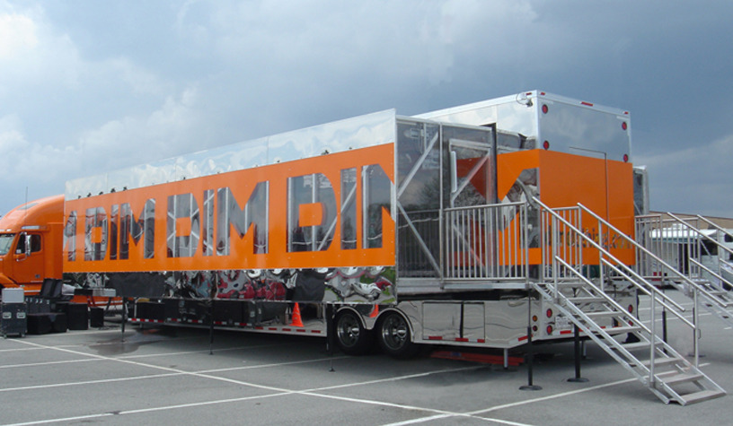
DIM, Mobile Retail Unit
Client: Sara Lee Corp / DIM
Building Type: Mobile Retail
Size: 1,000 SF
Completed: 2006
Consultants: Inbar Barak (Interactive Technology)
Photography: LOT-EK + Inbar Barak
A 53-foot long truck triples in size and opens with the push of a button to both sides. The mechanism of the folding floor dictated the distribution of program to stationary areas that follow the logic of the folding and unfolding of the truck. All clothing stacks, accessory drawers, fitting rooms and lounge seats pull out of the central container. The clothing display is reduced onto a thin layer of flat-screen monitors, creating an infrastructure for the rapid bi-weekly update of merchandise. The technological and mechanical environments demanded the interactivity that runs throughout the elements: The fitting rooms collapse to the ceiling to provide valuable space when not in use, and allow the folding of the pods; The cash register is a portable hand-held machine (new at the time!); The stack drawer monitors show a video display of its content when pulled open; Portraits of consumers from each retail location are collected to create a community; Reflective surfaces on the interior enhance the constantly animated display; The reflective surfaces of the exterior, makes this object contextual leaving the inside/outside connection filtered through the brand’s logo, which wraps around the object.
SANLITUN SOUTH
Client: Guo Feng Development
Building Type: Retail, offices + restaurants
Location: Beijing, China
Size: 240,000 SF
Completed: 2008
Photography: Shuhe Architectural Photography
AWARDS:
International Architecture Award, 2009
WA – World Architecture Community Award, December 2008
A new retail complex, with master plan by Hong Kong based The Oval Partnership, is organized like a medieval village with a dense fabric of narrow alleys, low-rise buildings, elevated walkways and bridges connecting all levels. LOT-EK was assigned the north-east section of the “village”, comprised of three separate and interconnected buildings, which were dedicated to retail, restaurants and event spaces. International architecture firms such as KKAA/Kengo Kuma & Associates, SHoP Architects and Sako Architects were also commissioned to design additional buildings. LOT-EK’s concept is centered on the old typology of the Chinese ‘HUTONG’, the internal urban alley animated by small retail, functioning as multi-level, open-air circulation. In each alley, a rhythmic system of scaffolding-like metal frames is wedged between the buildings, adapting to the varying width of the alley’s cross-section. The rhythm of the structure is based on the width of ISO shipping containers (8 feet), which are inserted randomly into the facades of the building and jut out into the alleys. At the ground level, the containers function as canopies that hover over the retail stores entrances and house display or other small functions on the interior. On the upper floors, containers are pierced and skewered by the horizontal circulation, functioning as entrances to the retail stores and as display windows along the loggias. The scaffolding-like structure extends the alleys out towards the main street of the Sanlitun area to lure in the passers-by. At every level the containers function as large three-dimensional graphic objects layered with signage and logos. Orange mesh, also pierced by shipping containers, wraps the external perimeter of the entire northeast section adding privacy and sun refraction along the outer façades.
MANAGEMENT ARTISTS
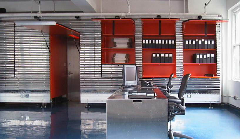
Client: Management Artists
Project Type: Office Renovation
Location: New York City
Size: 3,000 SF
Completed: 2001
Photography: Paul Warchol
The agency occupies a warehouse space with large windows running along 3 sides. Parallel to the windowless side, a 60’ long stainless steel truck container wall is built on site by the container manufacturer company itself. The various depths between the truck container wall and the existing walls behind it are used for storage/archive. The storage compartments are accessible through a double system of large pull up panels and small pull down panels, which are cut out of the corrugated metal skin. The pull down panels can be used as counter tops for quick office tasks. A system of stainless steel workstations on casters is devised to contain a 2-drawer filing cabinet and a full size CPU tower. A metal pipe magazine/portfolio rack, topped by a black rubber bench poured on site, runs the entire length of the wall opposite the truck container side. The concrete floor is coated by blue epoxy; the interior of all storage/archive compartments is painted safety orange.
BOON the shop
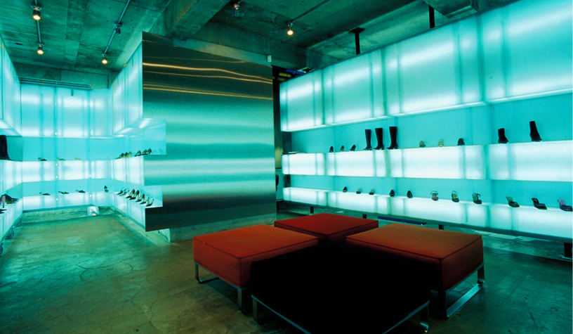
Client: Samsung / Shinsegae Retail
Designed: 2000
Building Type: Retail
Location: Seoul, Korea
Size: 8,000SF
Ribbons of translucent fiberglass are designed to transform the raw concrete space of a designer retail store. Supported by steel pipe frames, the ribbons appear to float between floor and ceiling – providing aesthetically pleasing light while also providing functional purposes for the commercial renovation. The ribbon panels are contoured to create two indentations. As the panels are repeated to generate the ribbon, these indentations generate two continuous grooves; a lower one for shoes and a larger upper one for boots, bags and other accessories. Rolling walls made out of the same panels are plugged into such grooves (like tracks). The rolling walls are used to break up the space on both floors, to create individual bags for each designer on the lower floor and two distinct exhibition areas on the ground floor. The ribbon glows with fluorescent flight produced by fluorescent tubes attached to the rear of each fiberglass panel. Different color gels can be installed around the fluorescent tubes to change the color of part or of the whole environment.
BILLBOARD BUILDING
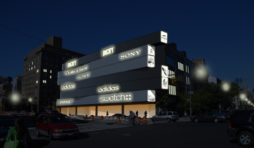
Client: Goldman Properties
Concept: 2009
Building Type: Café’, Storage, Advertisement
Location: New York City
Size: 11,000SF
Structural Consultant: Robert Silman Associates
Thirty shipping containers are stacked to infill an extremely narrow lot at a major New York City intersection. The irregular lot is over 170’ long by 20’ wide and posed a real challenge for potential usage and development. The Billboard Building is conceived as a long structure that occupies the area with a strong sculptural presence. The horizontal aspect of the containers and the perceived movement of the façade - as they are pushed in and out within the lot line - enhance the dynamic flow of traffic along this busy artery. The container doors and ends are removed and replaced with light-boxes to display rotating signage and video art. The façade advertisements provide another graphic layer to the building and serves as a potential source of revenue for the building owners.
PUMA DDSU
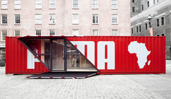
Client: PUMA
Building Type: Mobile retail
Size: 500 SF
Completion: 2010
Photography: Danny Bright
PUMA DDSU – Drive, Drop and Shop Unit – is a mobile retail module constructed from one 40’ ISO shipping container. The container expands laterally to double its interior space. Originally conceived for the 2010 World Cup, the unit is designed to optimize its operations and the logistics of mobility and set up. It is transported by truck or train, deployed on site and opened to its full configuration by pulling out the pod extensions on one side and opening the main entry access on the opposite side – where the corrugated-steel horizontal shutters transform into a canopy on top and a ramp for access below. The interior space is retrofitted with continuous shelving, utilizing the two triangular spaces that do not slide out as areas for cashiers and the drop-down fitting room.
PUMA CITY
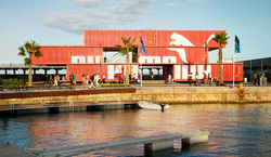
Client: PUMA
Building Type: Mixed-use (Event Space, Retail, Office, Leisure/Bar)
Location: Multiple Global Ports
Size: 11,000 SF
Structural Consultant: Robert Silman Associates
Mechanical?Sustainability Consultant: Rosini Engineering
Completed: 2008
Photography: Danny Bright
AWARDS:
2009 International Architecture Awards - The Chicago Athenaeum Museum
2009 I.D. Magazine, Honorable Mention for Best Environments
2009 Travel + Leisure Design Award - Best Retail
Twenty-four shipping containers are retrofitted and transformed into PUMA City, a transportable retail and event building. The building was assembled and disassembled a number of times at several different international ports. PUMA City is conceived as a three level stack of containers, shifted to create internal outdoor spaces, large overhangs and terraces. The structure is comprised of two full retail spaces on the lower levels, both designed with large double height celings and 4-container-wide open spaces – as a counterpoint to the modular box-quality of the container inner space. The second level houses offices, press area and storage, while a bar, lounge and event space with a large open terrace is placed at the top. The building uses 40-foot long shipping containers as well as a number of the existing container connectors to join and secure containers both horizontally and vertically. Each module is designed to ship as conventional cargo container through a system of structural covering panels that fully seals all of its large openings to be removed on site to re-connect the large, open interior spaces. At 11,000 square feet of space, it is the first container building of its scale to be truly mobile.
UNIQLO POP-UPS
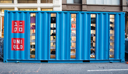
Client: UNIQLO
Building Type: Mobile Retail
Location: Global
Size: 160 SF
Completed: 2006
Photography: Danny Bright
Two 20’-foot containers tour New York City as retail shops, introducing Uniqlo to the United States. They are designed for placement in different city neighborhoods for special events, and function as branded pop-up stores – fully equipped with shelving space, cash-wrap, and fitting room. Vertical windows align with shelving to display folded merchandise on the exterior, expressing the warehouse-like stacks typical of the UNIQLO brand. The fitting room is a custom-designed duct, which gathers like an accordion towards the ceiling by a manually cranked pulley system. The store is lit by linear bands of light on both the floor and ceiling. Dressing mirrors line both ends of the containers, visually elongating the limited space.
SANLITUN NORTH
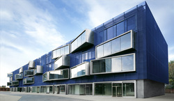
Client: Guo Feng Development
Building Type: Retail Complex
Location: Beijing, China
Size: 9,720 m²
Design: 2006
Photography: Shuhe Architectural Photography
Sanlitun North is located in one of the central Beijing neighborhoods that were radically transformed for the 2008 Olympics. Part of a large commercial development with Master Plan by Kengo Kuma, and conceived as one of the sides of an internal pedestrian piazza, the building houses primarily high-end retail on the lower levels along with restaurants and office suites on the higher floors. Facing the pedestrian piazza, the building elevation is conceived as a three-dimensional billboard to be filled with the graphics and logos of the future retail tenants. The building is wrapped by a layer of blue metal mesh that performs as a second skin - buffering the city noise level and filtering direct sunlight – while referencing a building under construction. Large extrusions pierce the mesh layer and bend in varying angles. Made out of stainless steel with large glazed fronts, these extrusions refer to large “air ducts” protruding out of the building mass; they extend the interior space/program over/onto the piazza functioning as entrances, display windows or billboards for the stores on the lower levels and as oversized bay windows for the offices above. At night, the extrusions become light boxes with white LED frames and float over the glowing blue mesh.
